System Redesign · Governance
Redesigning information architecture and governance for ~300 University Advancement staff across a 10-week internship.
Intranet
Information Architecture
Governance
SharePoint
ROLE
Product Design Intern
TIMELINE
10-week internship
SCOPE
University Advancement, MSU
TL;DR
The 30-Second Version
The UA Hub is an internal SharePoint platform at Michigan State University’s University Advancement division. Staff use it to access tools, training, HR resources, and internal communications. It gets consistent traffic with 26,446 visits in under a month. Staff were still going to email, direct links, and Microsoft Teams to get things done. This project diagnosed the structural failures behind that behavior and proposed a scalable redesign built on IA restructuring, UX flow validation, and a governance model designed to hold up after the internship ended.
THE BRIEF
A Trust Problem, Not a Traffic Problem
Traffic was never the issue. Experienced staff could find what they needed because they had memorized where it lived. New employees had no such map. Content duplicated across departments, pages went months without updates, and nobody could say who was responsible for either. Three systemic failures drove the redesign.
Memorization over findability
The architecture was built around departmental ownership, not user intent. Experienced staff succeeded through institutional knowledge. Anyone new to the organization was left to discover things by accident.
No content ownership
Seven stakeholder interviews confirmed the same pattern. Pages existed without named owners. Content became outdated. Duplication spread across sections with no mechanism to catch or fix it.
Platform confusion
Staff had no clear guidance on what belonged on the UA Hub versus Microsoft Teams. Both tools were in use. Neither had a defined purpose. The result was fragmented workflows and parallel information streams.
The project operated under real enterprise constraints. SharePoint limits layout, search, and personalization options significantly. Stakeholder expectations varied across HR, IT, and Communications. The internship ran 10 weeks with no guaranteed ownership handoff at the end. Every design decision was made with those realities in mind.

Legacy Training landing page, captured during the internship. Nine Quick Links, mixed intents.

Legacy Human Resources landing page. New Employee content lived here and under Training.
BUSINESS CASE
What’s at Stake
26,446
Visits, May 15–June 11
From 331 unique users against roughly 300 staff. Near-total reach, and not driven by a default homepage setting (at time of internship) — people were choosing to come back, repeatedly, without resolving what brought them.
15m 36s
Avg. session time
Long enough to suggest hunting rather than task completion — though SharePoint counts idle tabs, so treat this as a signal to investigate, not a finding.
98.2%
Desktop access
Near-universal desktop use set the priority order. SharePoint’s mobile limitations are real, but with 1.8% of sessions on mobile, fixing structure for the other 98% came first.
Inbound Support Deflection
HR and IT stakeholders confirmed staff regularly contacted colleagues directly for resources that should be self-serve. Those requests consume time on both ends. At scale, across 300 staff, that adds up quickly.
Onboarding Friction
One HR stakeholder said it plainly: “a fairly new employee was having a hard time, they discovered things by accident.” Every new hire who can’t navigate independently adds to HR support load.
RESEARCH
Making the Friction Visible
Research ran across the full 10-week timeline using qualitative and quantitative methods in parallel. Staff knew the platform was underperforming. Most couldn’t say exactly why — they had built workarounds so gradually that the friction had become invisible. Interviews made it visible.
Seven stakeholder interviews across HR, IT, Marketing & Communications, and Events. Site analytics from May 15 – June 11, 2025. UX audits across high-traffic sections. Qualitative usability check-ins at the individual level.
“Why do we even have an intranet and what are we supposed to do with it?” — Communications stakeholder.
Nobody had a shared answer. That was the root cause. Each interview surfaced different complaints on the surface — search failures, confusing labels, outdated content, a staff directory that sorts by first name. The structural failure underneath all of them was consistent: the Hub had been organized around content ownership, not around how staff actually needed to use it.
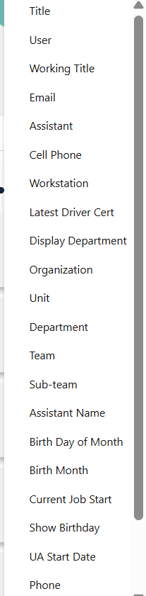
Legacy Staff Directory schema. Six overlapping fields for organizational membership — Display Department, Organization, Unit, Department, Team, Sub-team — alongside birthday and driver certification tracking.

Legacy Staff Directory, sorted by first name. Names redacted.
THE REDESIGN
Three Interventions
SharePoint imposes hard constraints on layout, search, and personalization. Search also degraded under peak load, which removed the usual fallback for a confusing structure — when search can’t be trusted, navigation must work on the first try. Every solution here was pressure-tested against what the platform could actually support.
Information Architecture Redesign
Restructuring around intent didn’t mean fewer top-level sections. Tools became Internal Resources to hold what had been scattered across three places, and Strategic Talent Management was surfaced from where it had been buried. Six sections that match how staff think beat five that match how departments are organized.
UX Flow Validation
UX flows tested whether staff could complete core tasks without memorization. Each flow mapped labeling clarity, escalation paths when content wasn’t immediately found, and handoff points between the Hub and Microsoft Teams. The benchmark: a new employee completes a core task on day one without asking a colleague for help.
Governance as UX Infrastructure
Governance was embedded into the redesign as a structural element, not an afterthought. Each department page received a named content owner. Review cadences were defined. Standardized templates were created so non-designers could maintain consistency without design training. Governance infrastructure is what allows an IA to hold up over time. Without it, even a well-structured system degrades.
Root Causes
Inconsistent Navigation & labels
Unreliable Search
Outdated/ Duplicated Content
Unclear Ownership & Governance
User Experience Issues
Can’t Find Content
Rely on Memory or Email
Low trust in content accuracy
Confused about the Hub’s Purpose
Organizational Impact
Low Adoption
Manual Workarounds
Inefficient Onboarding
Hub not a “Source of Truth”
Four structural causes, four user behaviors, four organizational costs. The chain runs one way.
INFORMATION ARCHITECTURE
Restructured Around Intent

Structural failures compounded into a system only navigable by memory — usable for veterans, opaque to anyone new.

The redesigned IA restructures navigation around user intent — with named ownership in every section footer and a Quick Start on each page for new employees.
TAXONOMY DECISIONS
Tools
Internal Resources
“Tools” held apps, documents, and help links — three intents under one word. The new label describes what’s inside rather than implying software.
Training (learning + support mixed)
Training, with support split to Help Desk
Learning something and getting unstuck are different needs. Merged, neither was findable.
Systems & Tech (top level and nested under HR)
UA Technology Systems, under Internal Resources
Same content, two homes, no canonical owner.
(no orientation path anywhere)
Quick Start, on every page
New employees landed on any section with no idea what it held. Site-wide meant orientation didn’t depend on which door someone came in through. Named for the moment of need rather than the content type.

A new employee’s path from the UA Hub homepage to a support escalation — six steps, zero dead ends.
THE BUILD
Built in SharePoint, Published, Not Adopted
The final screens I built for the internship.

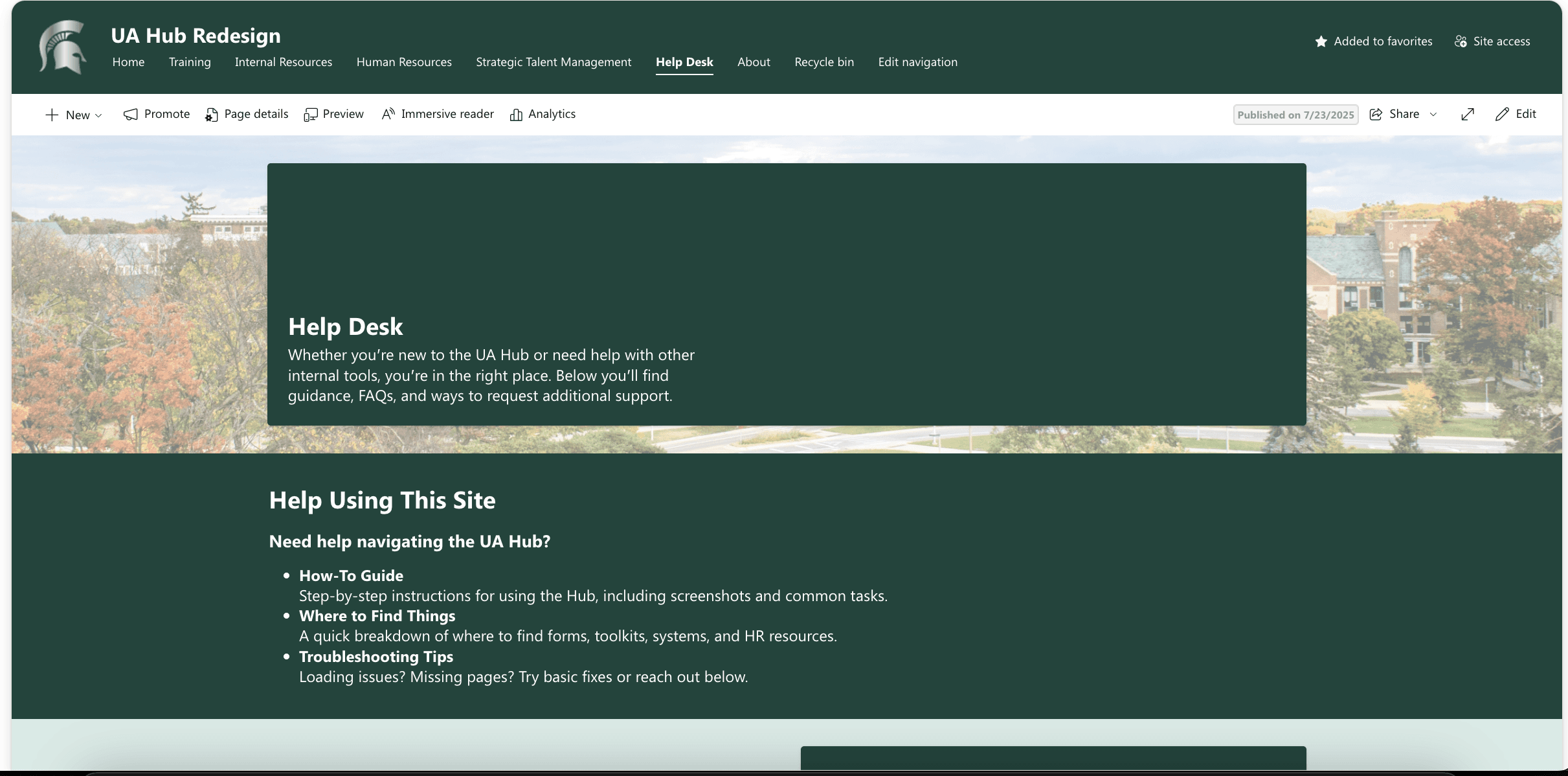


UA Hub Redesign, built in SharePoint and published as a parallel site during the internship.
OUTCOMES
What It Delivered
The redesign was built and published as a parallel SharePoint site. It was not adopted as the live UA Hub within the internship timeline — that decision sat with leadership. Outcomes are measured against documented friction points.
Cross-Functional Alignment
Stakeholders across HR, IT, and Communications converged on the same diagnosis: the Hub and Teams have no defined boundary, and that gap is producing parallel information streams. Agreement on the problem is not the same as a policy, which is why formalizing the boundary is the first recommendation below — but for an organization where the question had never been raised formally, naming it was itself a deliverable.
Governance Model Alignment
One IT stakeholder confirmed alignment on the department ownership model. They identified content maintenance as the platform’s core bottleneck. The proposed ownership model addresses that bottleneck directly.
Findability Gaps Mapped
Proposed IA changes mapped directly to the top complaint categories from every interview: navigation label confusion, content duplication, and staff directory usability.
Metrics to Track
Time-to-task for core workflows, usage of redesigned entry points, HR and IT request volume related to content discovery, and content freshness rates by section.
RECOMMENDATION
Three Decisions Before Any Visual Redesign
None of them are design decisions.
01
Assign governance before shipping design changes
Content without named owners decays. The priority is assigning a content owner to every section and defining a review cadence. Visual improvements applied to ungoverned content will erode within a year.
02
Define the Hub versus Teams boundary at the leadership level
Stakeholders agree the boundary is missing. What doesn’t exist yet is a policy, and only leadership can issue one. The Hub for transactional self-service — forms, directories, training, HR processes. Teams for communication and collaboration. Nothing that needs a permanent home should live only in email.
03
Assign a product owner to the intranet
Intranets treated as one-time projects accumulate debt fast. A named product owner with authority over content standards and a mandate to track performance changes that dynamic. Metrics worth tracking: self-service rate, support ticket volume, onboarding time-to-task.
REFLECTION
What Enterprise UX Taught Me
Enterprise UX taught me that the interface is rarely where the hardest problems live. The real challenges on this project were organizational — getting seven stakeholders with competing priorities to agree on what the platform was supposed to do, making design decisions that could survive SharePoint’s constraints, and building a governance model that non-designers could actually maintain after I left.
Framing design decisions in business terms was necessary. Stakeholders didn’t respond to UX rationale alone. They responded to operational cost, onboarding efficiency, and reduced support burden. Learning to speak that language — and to design systems that outlast the designer — shaped how I think about every enterprise problem since.
Product Design Intern · University Advancement, Michigan State University · 10-week internship